Cards
Module One
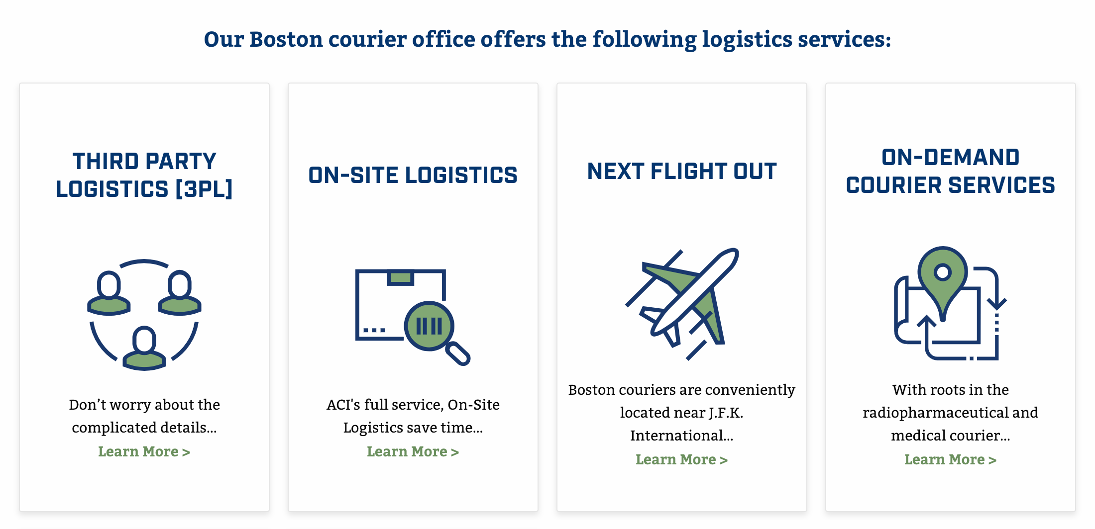
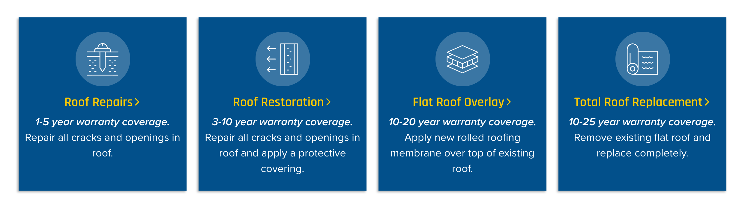
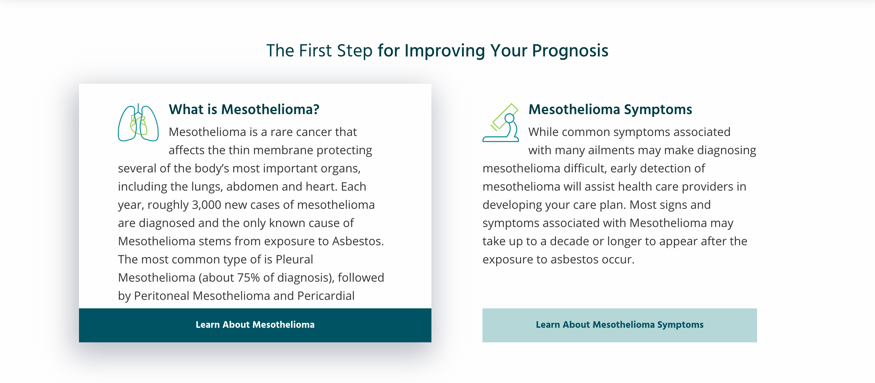
Cards with Icons
This option represents a standard card design with a header at the top, graphic in the middle and text and link at the bottom.
Module Two
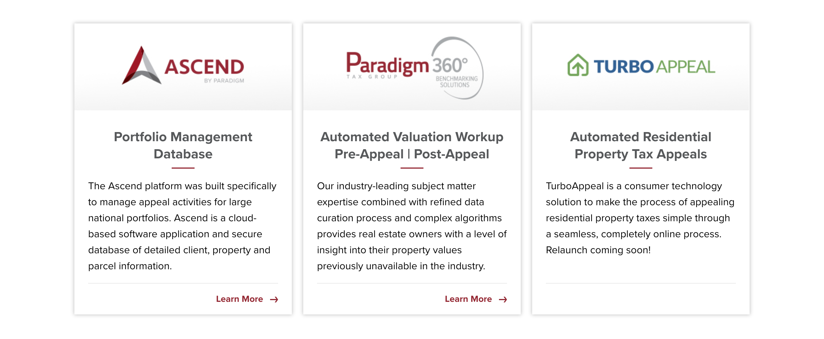
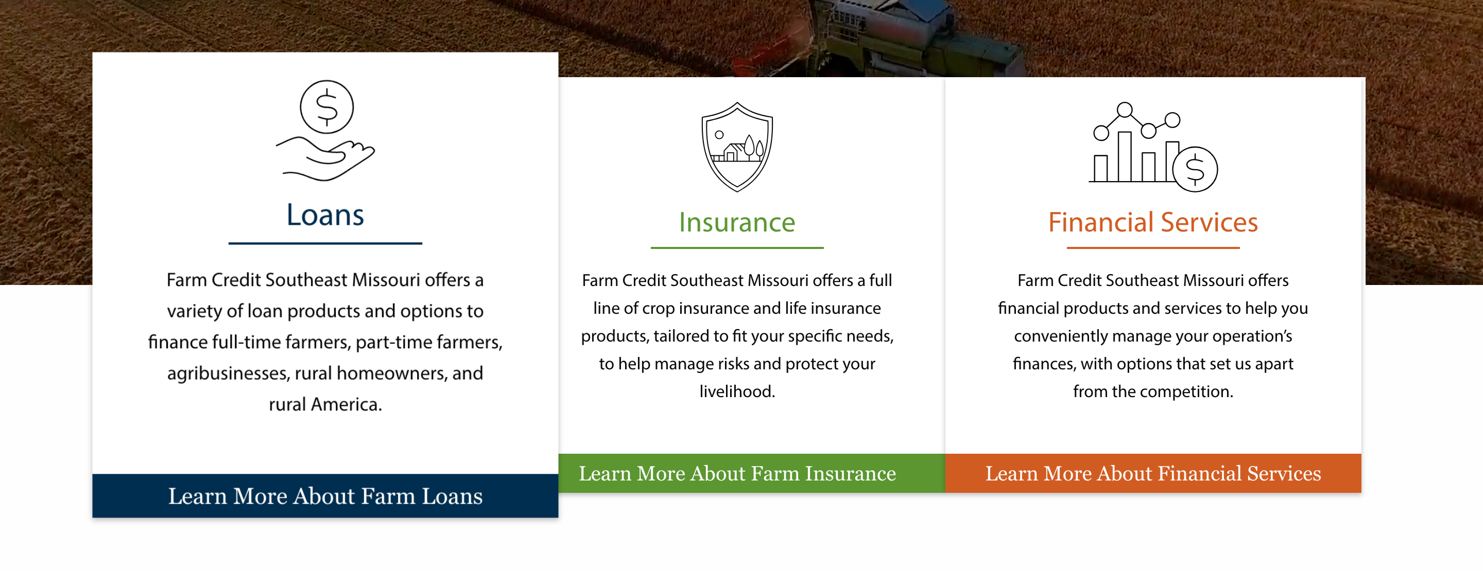
Cards with Logos
Another common card format with the graphic at the top, header and text in the middle and link at the bottom.
Module Three
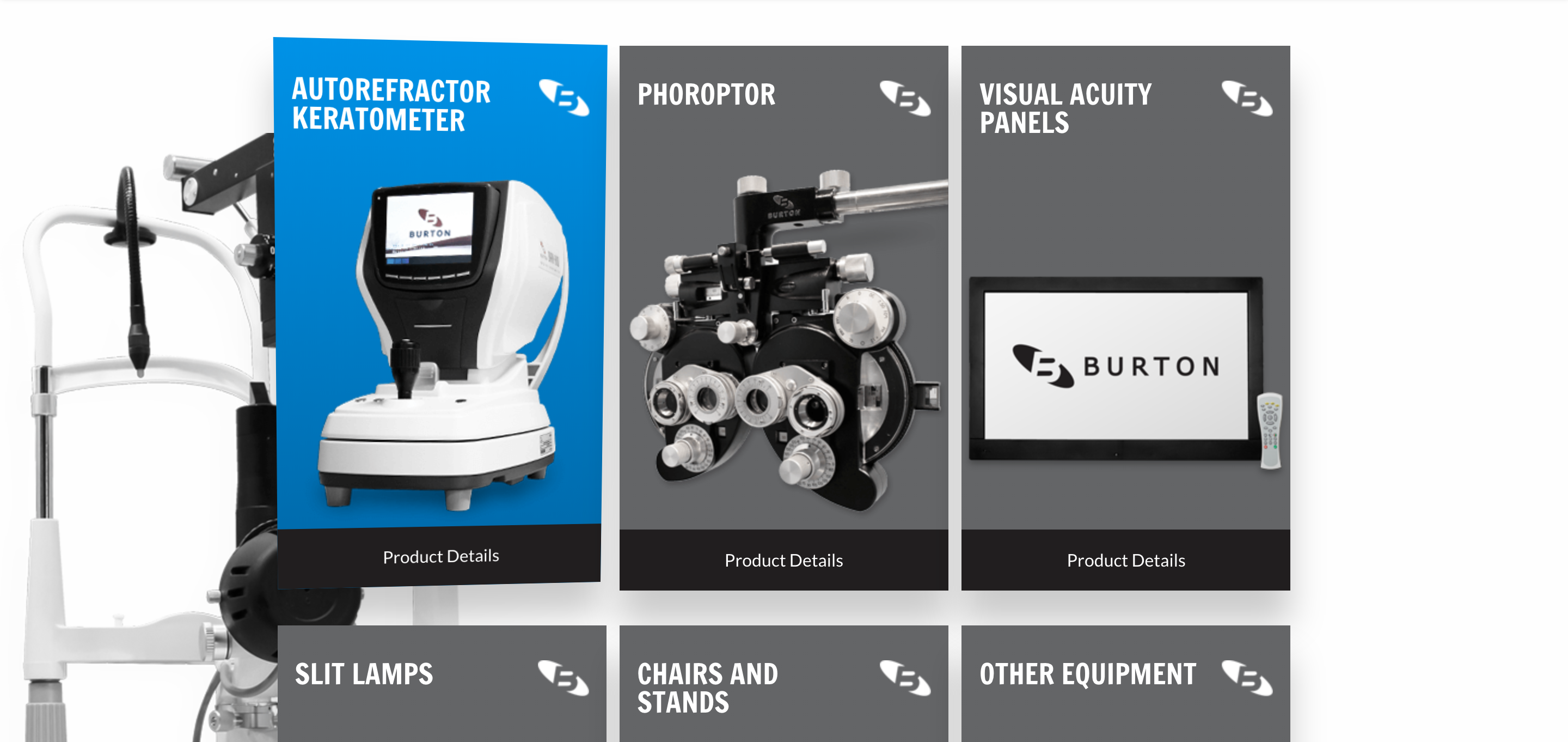
Explainer Cards
These particular cards are smaller on the page and have the header at the top, graphic in the middle, text at the bottom, and the entire card acting as the link.
Module Four
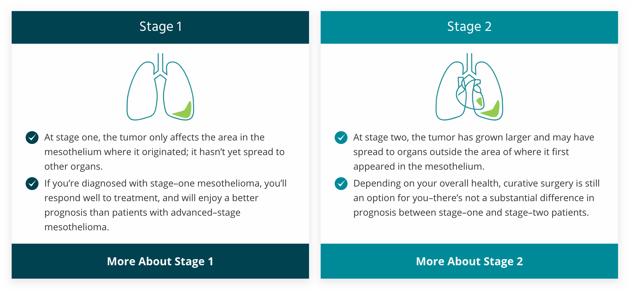
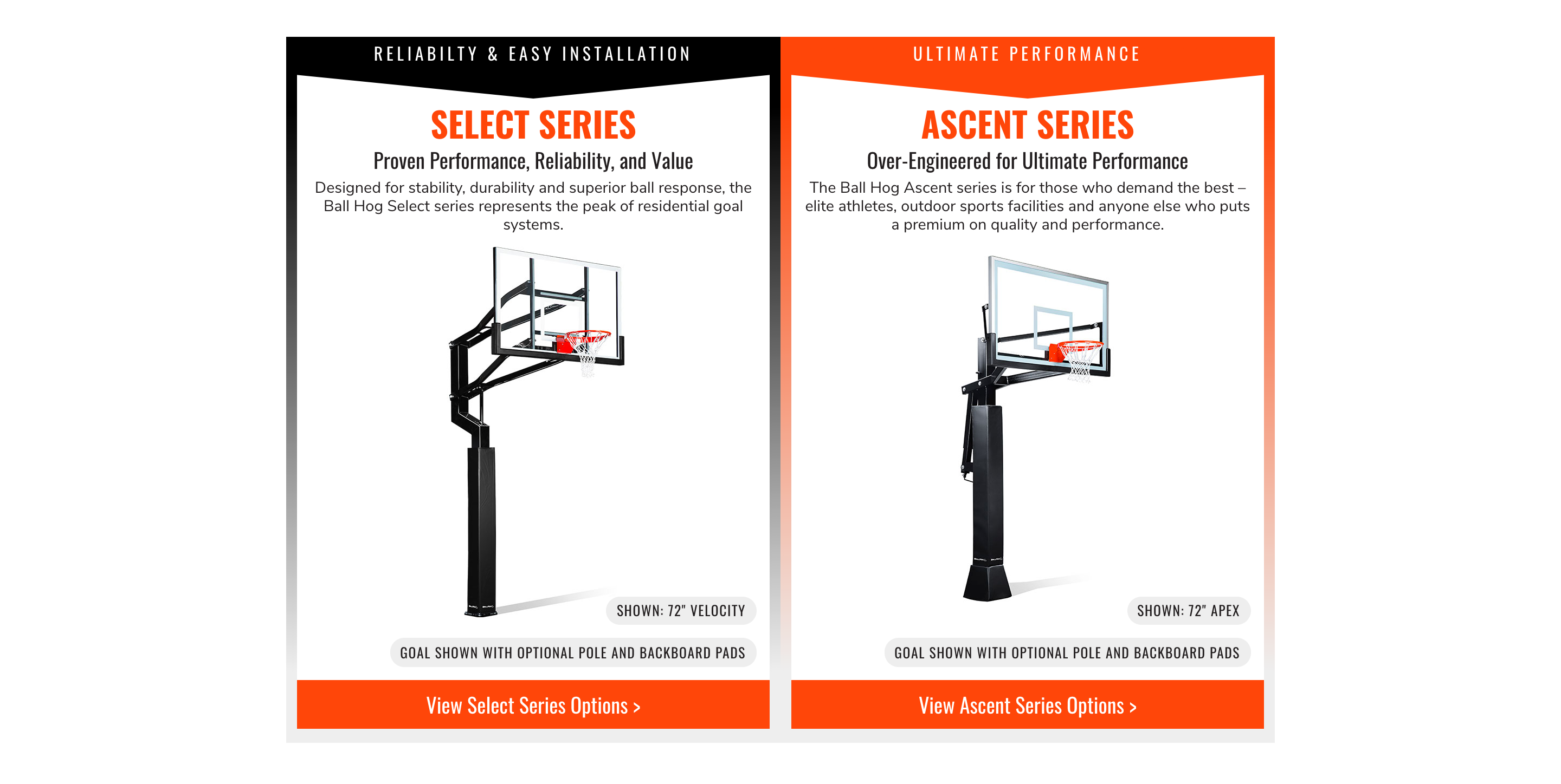
Comparative Cards
Often used to compare two products, these large cards highlight a lot of information with a header, sub-header and text at the top, image in the middle, link at the bottom, and additional callouts throughout.
Module Five
Cards with Images
This is another approach to a card format with the entire card acting as the link, but with the cards overlaid on a band with a background image.

Module Six
Standard Cards 1
With a background image to anchor them in place, these cards represent another approach to a common card format with a pop-out hover animation.

Module Seven
Standard Cards 2
Another example of a standard card with a pop-out hover animation and overlapped with a header video.
Module Eight
Tilting Cards
These cards are unique in that they only have a header, image and button and they tilt depending on where you hover over them, making them more engaging.
Module Nine
Cards With Icons 2
With the header serving as the button and a subtle hover animation, these cards offer a simple way to introduce a lot of information.
Module Ten
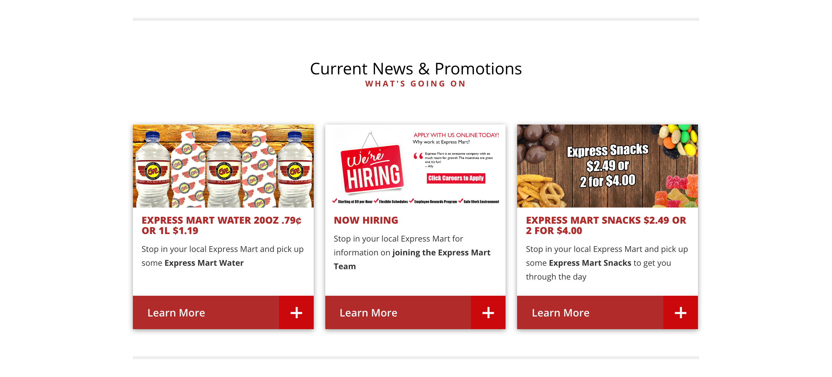
Cards with Images 2
This setup uses cards to call out specific news and promotions that the company wants to emphasize to its customers.
Module Eleven
Simplistic Cards
Another approach to introducing a lot of information in a simplistic way, with the header and icon overlaying the background image.

Module Twelve
Cards With Images 3
Another version of a standard card with the image at the top, header in the middle and text and link at the bottom.

Module Thirteen
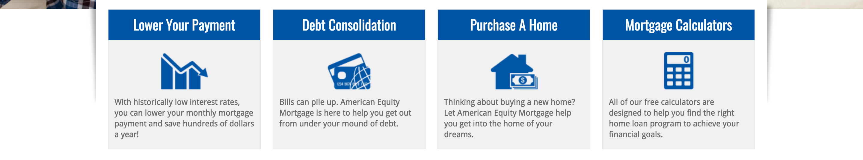
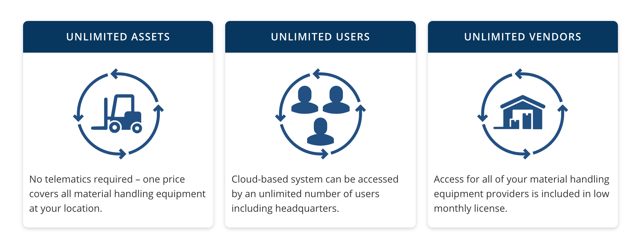
Cards With Icons
These particular cards don’t link to another section of the website, but instead simply bring attention to the specific information that they display.
Module Fourteen
Invisible Cards
This option presents the information as a block of text that reveals the card with a pop-out effect when you hover over the text.
Module Fifteen
Explainer Cards 2
Often used to explain multiple steps in a process, these cards are large and text heavy to entice the reader to find out more about a specific step.